Sunday, 14 November 2010
My Photography
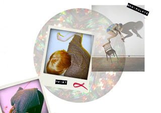
From my research I chose words that I felt summed it up such as Hypermobitlity, manipulate, twist, movement and distortion. I then used models to create different positions which represented this. I like the way that the fabric of the garments that the models were wearing morphed into a new shape and patterned fabrics distorted. I would like to look into creating these interesting shapes with clothes, maybe without them being moved or the garment morphing into a different interesting shape when they are moved.
Wednesday, 10 November 2010
Concept...
My concept has evolved from my research, I have focussed on non verbal communication and the way the body can be moved and placed within garments. I have also started to look at how light is used to attract and detract movement, taking colour and print inspiration from kaleidoscopes.
Colour pallet
I started thinking about light and movement and the colours involved. I noticed that when looking through a kaleidoscope it is the light shining through the bottom of it which allows you to see all of the shapes forming and morphing into new ones. It also aluminates it to show these amazing bright colours which make the movement so aesthetically pleasing to watch.


I took these photos by placing my lamp under a kaleidoscope and pointing the camera lense down the hole that you look throuh. (no flash)
Sam Taylor Wood
Charlie Engman
Updated Sign Language...

Do the legs have to be straight?

Charlie Engman does a lot of photography for companies such as URBAN OUTFITTERS and Dazed And Confused and I love his work. These photos which are particularly focussed on the body and movement really intrigued me. It has encouraged me to start thinking about pattern cutting and how the body is positioned when we design them.
Do the legs have to be straight?
charlie chaplin - the circus - [the mirror maze]
The video by Bruce Nauman made me think about silent films and the way that the movements were exaggerated because of the 16 frames per second film. This led me to looking at this Charlie Chaplin film. Although there are some sub titles most of the communication is done through movement such as mime and body language.
Tuesday, 9 November 2010
Bruce Nauman - Walking in an Exaggerated Manner...
Bruce Nauman created this video of walking in an exaggerated manner around the perimeter of a square, I like the exaggeration of the body movements and this is something I would like to look into further to influence my designs.
Sunday, 7 November 2010
E4 Moodwall 2007
I find this mood wall intriguing because of the positive reaction people give to this light. Unlike in the previous video where the light was shining on them and they wanted to get away this light seems inviting to people, this could be because it reacts to them?
ACCESS - an interactive art installation by Marie Sester
This was the first art installation that I came across when I started my research. I love the way people react to the light and how this initiates a reaction from the person, which was always in some form of movement. You can tell the people are trying to get away from this light and/or figure out where it is coming from just by the way they move and their body language.
So...what is Process Art?
Term applied to art in which the process of its making is not hidden but remains a prominent aspect of the completed work so that a part or even the whole of its subject is the making of the work.
Taken from the glossery on the Tate website...http://www.tate.org.uk/collections/glossary/definition.jsp?entryId=234
Taken from the glossery on the Tate website...http://www.tate.org.uk/collections/glossary/definition.jsp?entryId=234
Subtraction cutting
The basic principles of Subtraction Cutting are that the patterns don’t represent the garments outward shape, but the negative space which will form a hollow structure. This technique was developed by Julian Roberts, a well respected fashion designer and film maker who has shown 13 collections at London Fashion week. He is winner of the British Fashion Council's 'New Generation Award' gaining this title times.
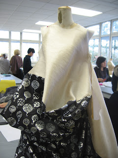
I attempted Subtraction cutting with Chalsie Williamson and Lily Stodel, this is what we did...
And here are some photographs of the process...
Final outcome...
This technique is unpredictable but after a few more attempts and experimentation I think that it would be easier to predict what the outcome may look like. Subtraction cutting is something I would like to investigate further.
Future Beauty, 30 years of Japanese Fashion (Barbican art gallery, London)
A couple of days after my briefing I went to London to visit the Future Beauty, 30 years of Japanese Fashion exhibition at the Barbican art gallery, London. This was very useful and inspirational visit as it enabled me to experience what is possible with cutting techniques and fabric. Here are a few photos and sketches from the exhibition that I found particularly interesting.
Yohji Yamamota, 1983 Spring/Summer white cotton plain-weave cut work jacket and dress.
It was the volume of this garment which also attracted my attention. The chains wrapping around the body creates the effect that the bottom of the garment is trying to escape from this restriction.
Naoya Hatakeyama, 2009
This coat is made out of a fine plastic and is made out of pockets containing paper with Japanese writing on. This is a very literal portrayal of language as a form of communication but interesting and innovative none the less.
Junya Watanabe, Autumn/Winter 2000
Junya Watanabe, Autumn/Winter 2008-9
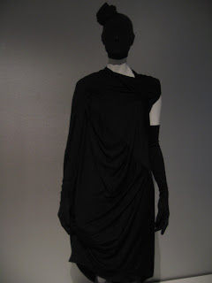
This interested me because of the face being covered up. This suggested to me that this garment really is a piece of art and the wearer is not important.
Yohji Yamamota, 1983 Spring/Summer white cotton plain-weave cut work jacket and dress.
I really like the way that the fabric has been cut to form this intricate detail, it is most likely cut using a laser cutting cad system.
Jun Takahashi/undercover, Spring/Summer 06This garment attracted my attention due to the volume of the piece and that it is made up of small circles creating an interesting texture.
Rei Kawakubo,
Spring Summer 2009
Junya Watanabe, Autumn/Winter 2009-10It was the volume of this garment which also attracted my attention. The chains wrapping around the body creates the effect that the bottom of the garment is trying to escape from this restriction.
Naoya Hatakeyama, 2009
This coat is made out of a fine plastic and is made out of pockets containing paper with Japanese writing on. This is a very literal portrayal of language as a form of communication but interesting and innovative none the less.
Junya Watanabe, Autumn/Winter 2000
Junya Watanabe had various garments from her collections at the exhibition but this one, to me was the most striking. I love the way that the material is folded and the intricate shape that explodes from the wearer’s neck.
Tas Kurishana, 2005-6
The knitting and crochet on these garments is what struck me. Knitting is not normally associated witch corsetry and underwear but it looks incredibly delicate and pretty.
This interested me because of the face being covered up. This suggested to me that this garment really is a piece of art and the wearer is not important.
Issey Miyake
This garment to me looks a lot like origami and this can be seen in the pattern piece photographed underneath the garment. This is an interesting and innovative way of pattern cutting and adding detail to the garment.
Tamae Hitokawa
Subscribe to:
Comments (Atom)


